Data Confirms What You Already Knew About Newsletter Ad Placement
Newsletter advertisements that appear when a subscriber first opens the message in Gmail or Apple Mail is more than twice as valuable as other placements.

Data from more than one billion newsletter impressions demonstrates that ads near the top of an email message perform better than those below the first 1,000 vertical pixels. But you probably already guessed that.
We all know how we read email newsletters. The newsletter opens at the top of the message in our email client. We scan the first bit, and if something catches our fancy, we read the whole thing. Thus, we are more likely to see an ad near the top of the message. The fact that data confirms what we would have guessed isn't so shocking.
Ad Performance Data
The findings I referred to in the first paragraph come from more than one billion opened email newsletters. The data excludes non-human interactions like Apple's Mail Privacy Protection or a filter checking for spam. So we have bonafide human opens in view.
The original data shows revenue per thousand impressions and click-through rates based on vertical position in the newsletter, but that part of the research is proprietary, so what you see in this article is a relative scale that I called an "ad value unit."
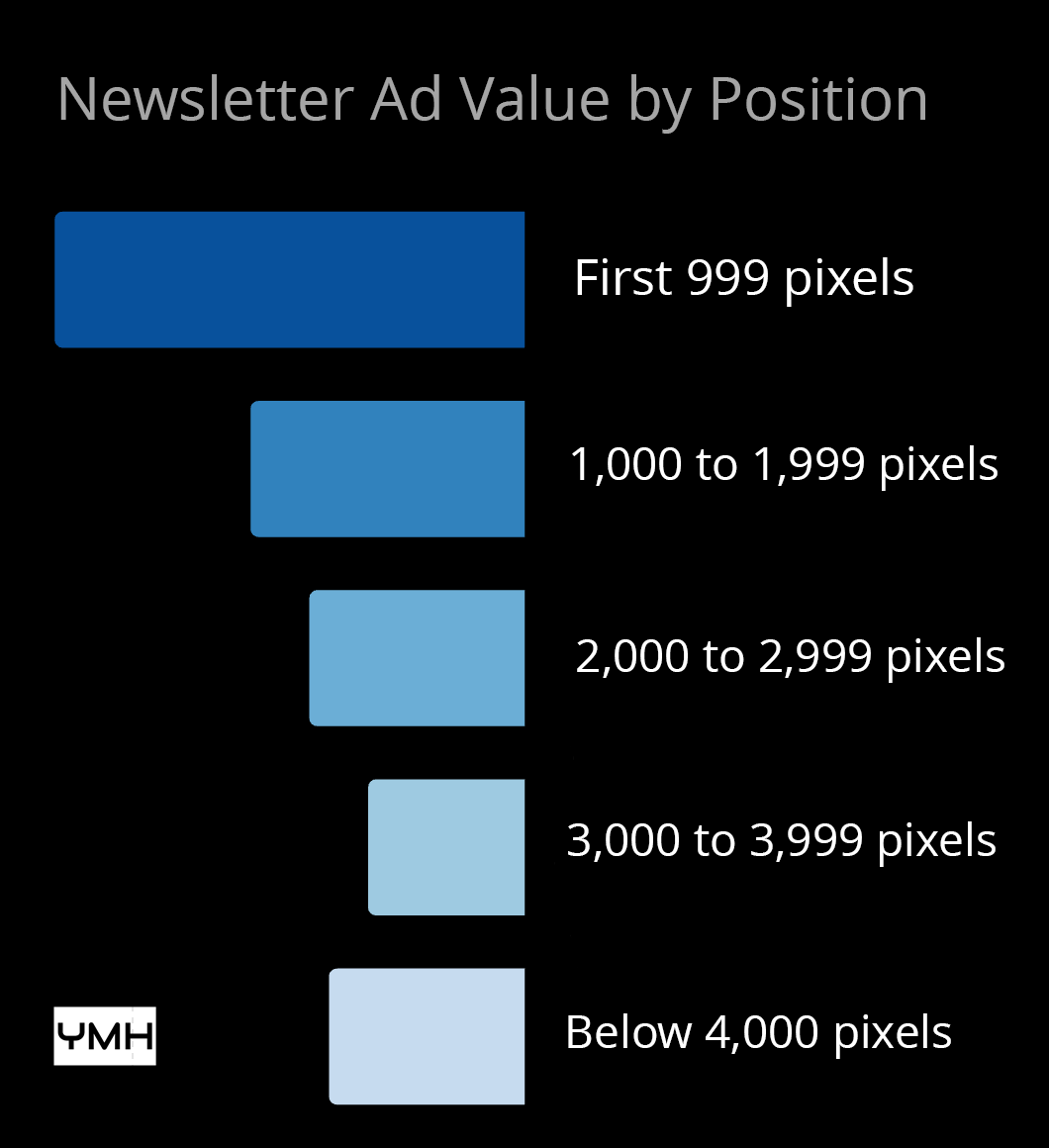
In this chart, an ad placed all the way at the bottom of a newsletter represents the baseline or one ad value unit. Placing the advertisement above the proverbial fold more than doubles the ad's value.
| Newsletter Ad Position | Ad Value |
|---|---|
| Below 4,000 pixels | 1 ad value unit |
| 3,000 to 3,999 pixels | 0.8 ad value unit |
| 2,000 to 2,999 pixels | 1.1 ad value unit |
| 1,000 to 1,999 pixels | 1.4 ad value unit |
| 0 to 999 pixels | 2.4 ad value unit |

Observations
There are, perhaps, only two important takeaways from this data.
- Most newsletters are not read from top to bottom.
- An ad in the footer is just as good as an ad in the middle.
Let's ruminate on these ideas in turn.
Unless we assume that identical ads become less interesting lower in an email newsletter, this data implies that many, if not most, newsletter readers only look at the part of the newsletter that appears when they open it in Gmail or Apple Mail.
There is only so much space in the first 999 pixels, so newsletter operators must decide how important an ad is relative to capturing a reader's attention.
Next, notice that an ad placed between 2,000 and 2,999 vertical pixels of a long-form newsletter performs a mere 10% better than an ad below 4,000 pixels.
For some newsletter creators, it might make sense to earn a little less from each newsletter and move the ad down out of the way of the content.